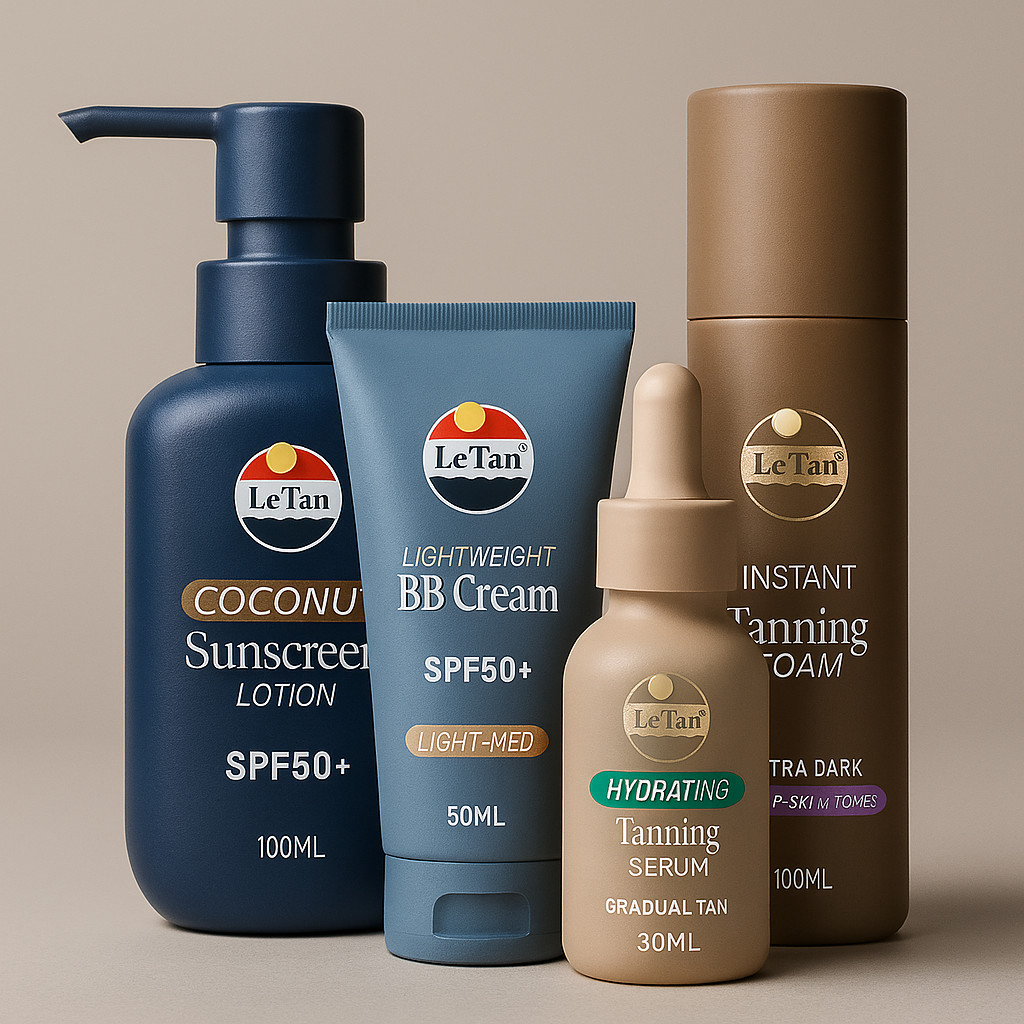
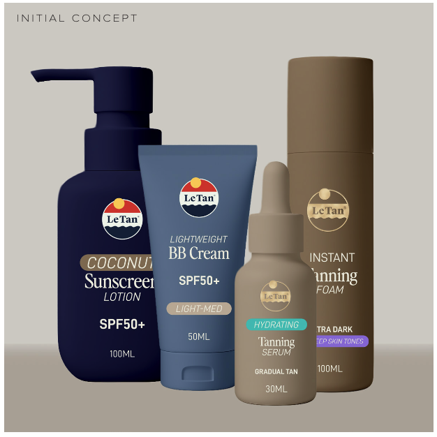
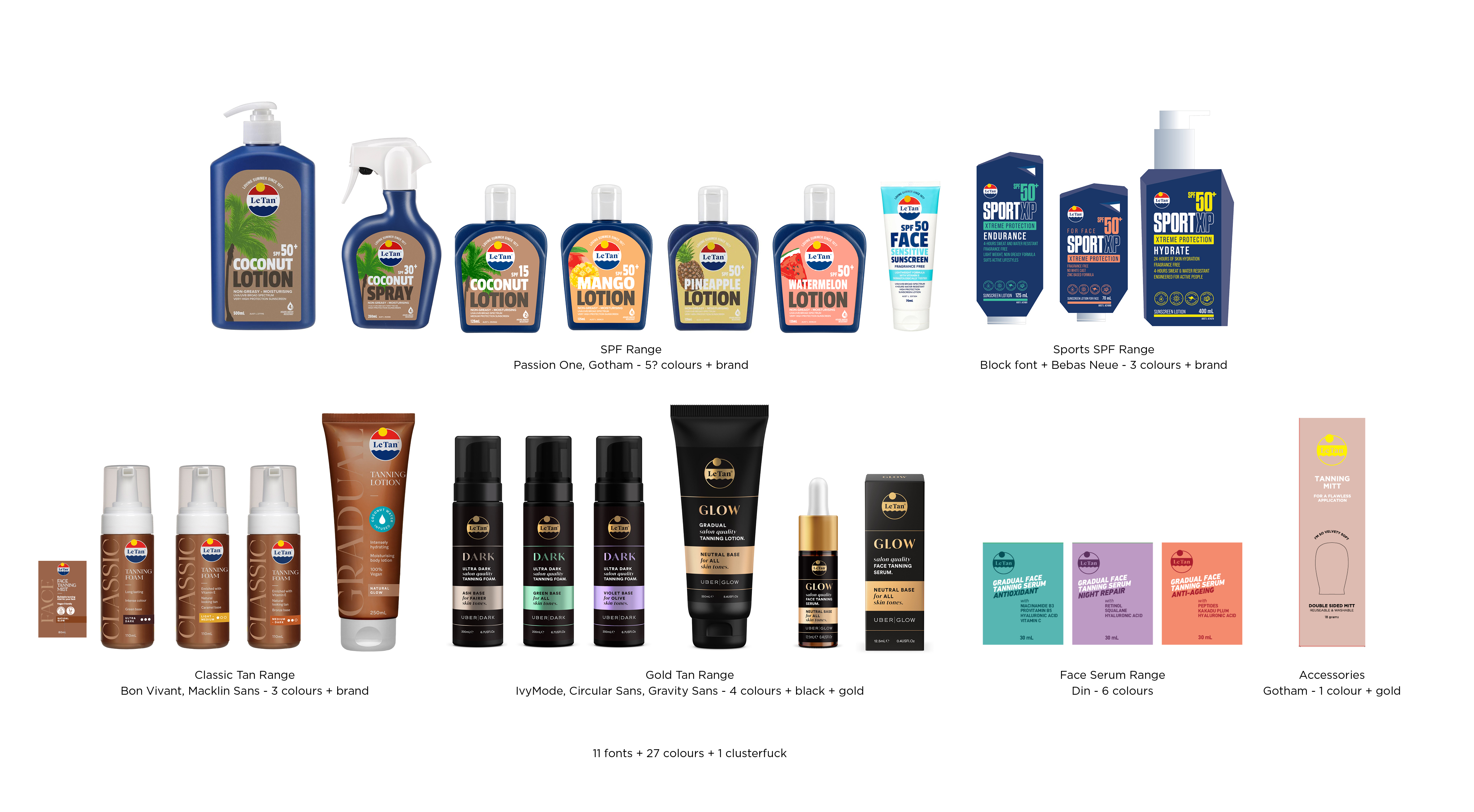
Le Tan Rebrand (Concept)

Whilst it is still unseen, I learned the in-and-outs of the brand, and knew the customer pain points intimately when working on this. They had started a rebrand and stopped working on it, but the concept was to work on a retro look. I tied this in, whilst bringing new life, and an easier to understand product system.

challenge:

Concept to revitalise Le Tan’s packaging across their extensive tanning product range. With over 19 colour ways and nearly 30 font styles in current circulation, the goal was to clean up the chaos and rebuild a modern, scalable system that feels iconic, accessible, and on-brand across retail shelves.

Strategic approach:

Audited existing packaging landscape and identified major pain points in consistency, hierarchy, and SKU logic

Designed a refreshed visual direction with simplified colour usage, font system, and core layout rules

Created concept packaging for key SKUs to demonstrate versatility and shelf impact

delivered:

Built the foundation for a packaging strategy that could scale across formats without diluting brand recognition

Positioned Le Tan to better compete with newer players in the category while still holding its legacy status

impact:

Problems addressed: Visual clutter, inconsistent type, unclear hierarchy, weak shelf presence

Design goals: Clarity, recognisability, modernity, flexibility