Aspect Skincare – Visual Cohesion Across a Multi-Brand System
Multi-brand packaging system and strategy that turned visual chaos into consistency.
Multi-brand packaging system and strategy that turned visual chaos into consistency.
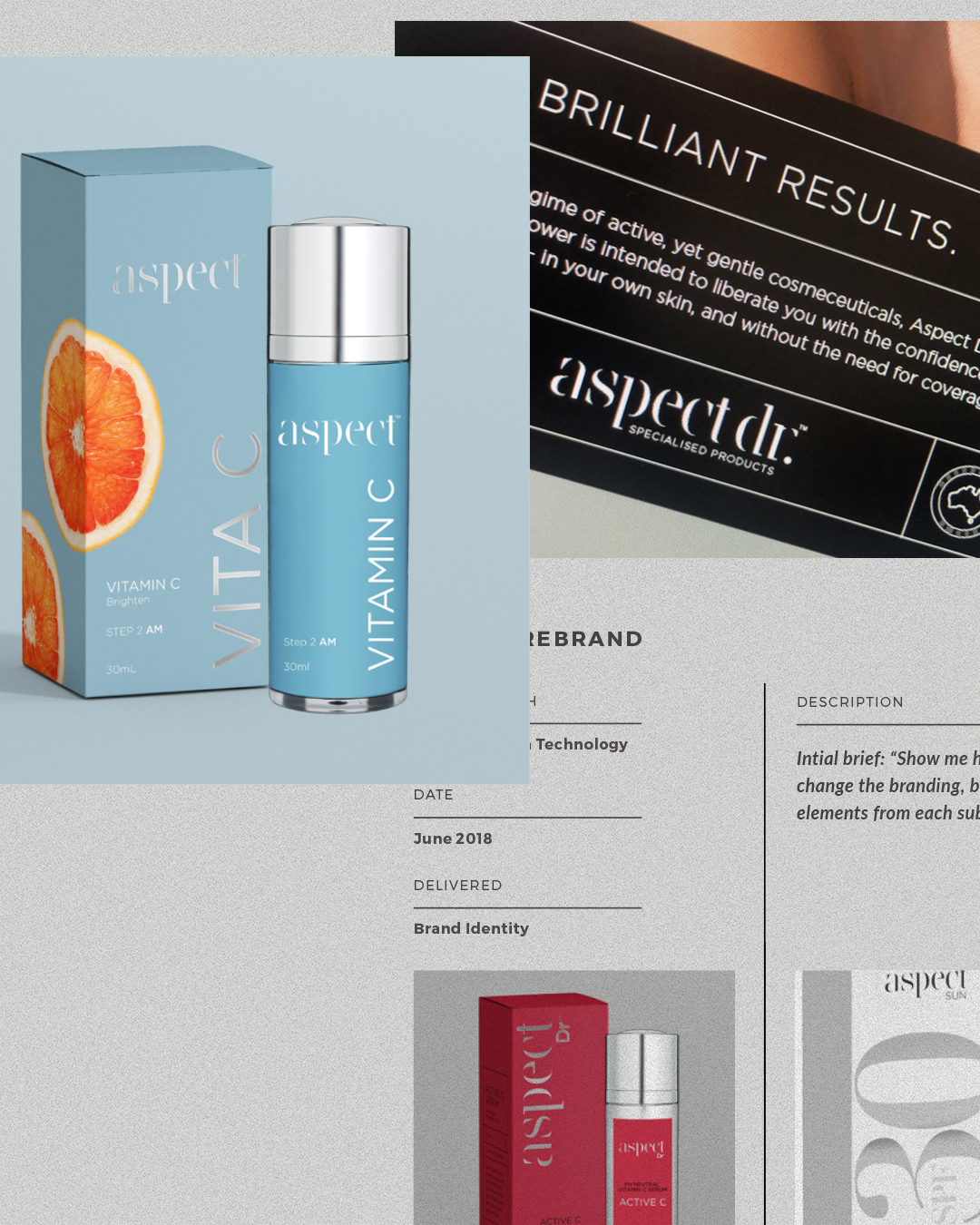
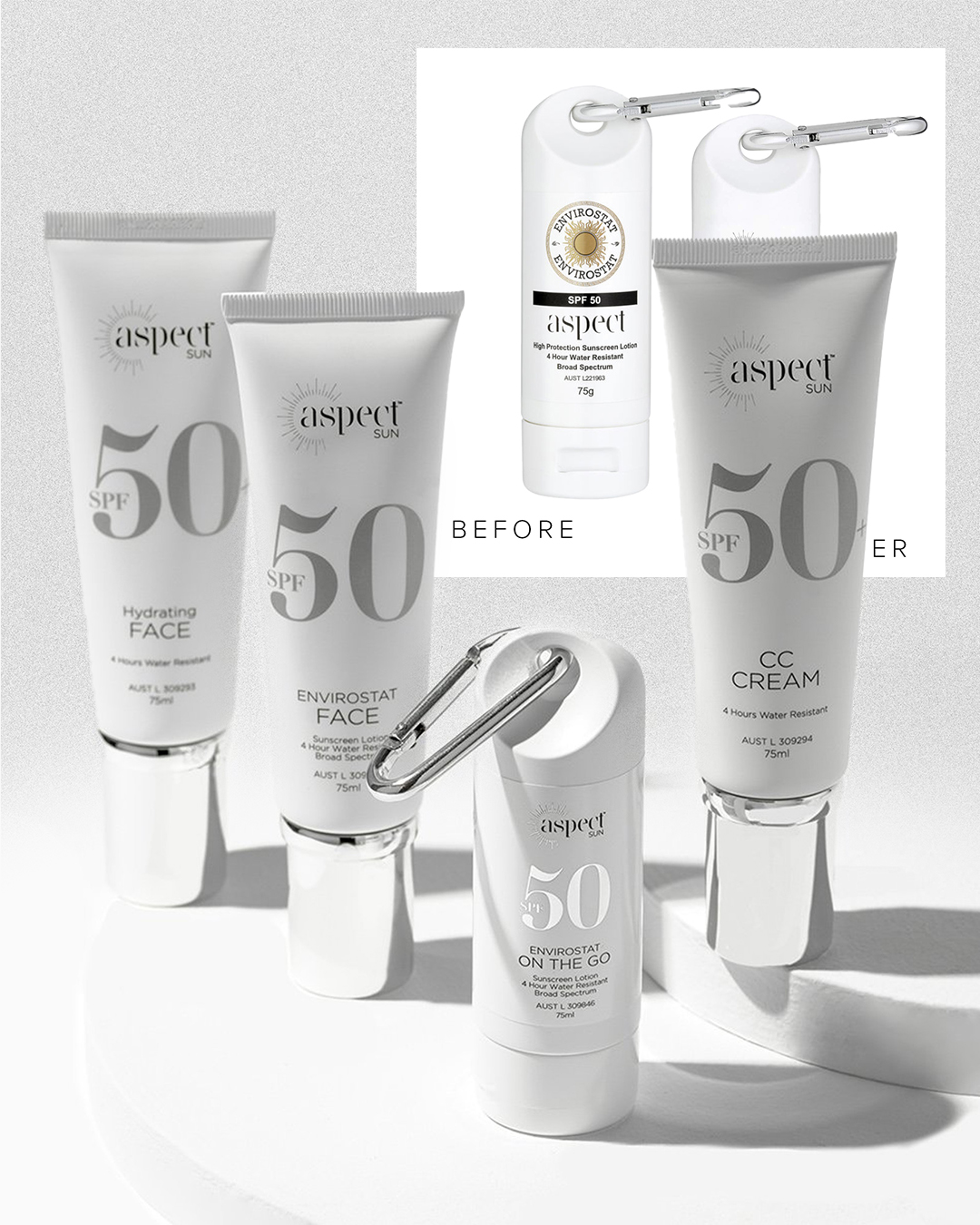
Aspect had a loyal clinical following and a trusted name — but the packaging and visuals across its sub-brands were misaligned. Aspect, Aspect Dr, and Organic Nation felt like cousins, not siblings. Messaging clarity was inconsistent. Print and digital materials lacked polish. The entire system needed refinement.
We didn’t just redesign — we restructured. Focused on a scalable visual system that worked across multiple SKUs and product tiers. Developed a packaging architecture that could be adapted brand-wide. Brought the tone, colour story, and design logic into visual alignment. Built templates and systems so internal teams could execute future assets with confidence.
Packaging, Print, Digital Assets, Creative Direction

Kate is always providing exceptional quality work, I wouldn't want to work with another designer ever! We've worked together so much now, I wouldn't change it. Her versatility and attitude towards getting things done is outstanding.