Humans are narrative blokes.
We love a story arc, even in a photo. When we see a group of objects, our brain desperately tries to string them into a sequence: beginning → middle → climax → resolution.
In skincare, this story is the routine. If your image makes someone feel the routine flow, they imagine themselves using the products (a.k.a. mental trial). And if they mentally try it, they’re closer to buying it. Sneaky? Absolutely.
The eye loves rhythm and balance.
The human eye is obsessed with patterns, symmetry, and flow. When shit is chaotic in a bad way, it triggers discomfort (and no one drops cash when they’re uncomfy).
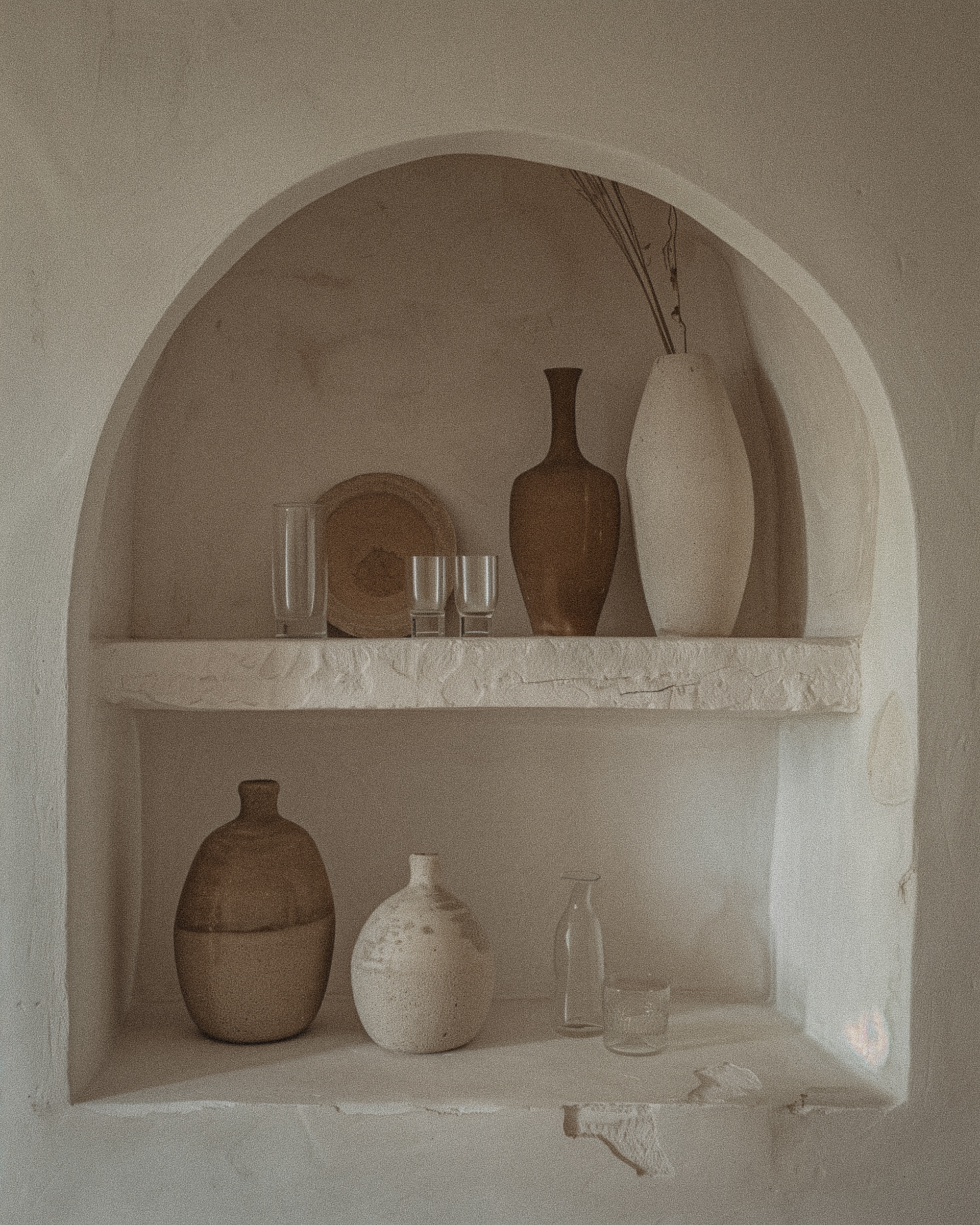
The arrangement’s shape — triangle, pyramid, soft wave — guides the eye smoothly and keeps attention locked longer. More time looking = higher chance of desire = swipe that fucking credit card.
Size hierarchy triggers authority.
When a product is bigger or placed centrally, it’s perceived as the leader, the “main character.” People instinctively trust and gravitate towards the biggest or most prominent element first.
The same primal rule that made us obey the biggest caveman now makes us worship that shiny serum bottle in the middle. Savage.
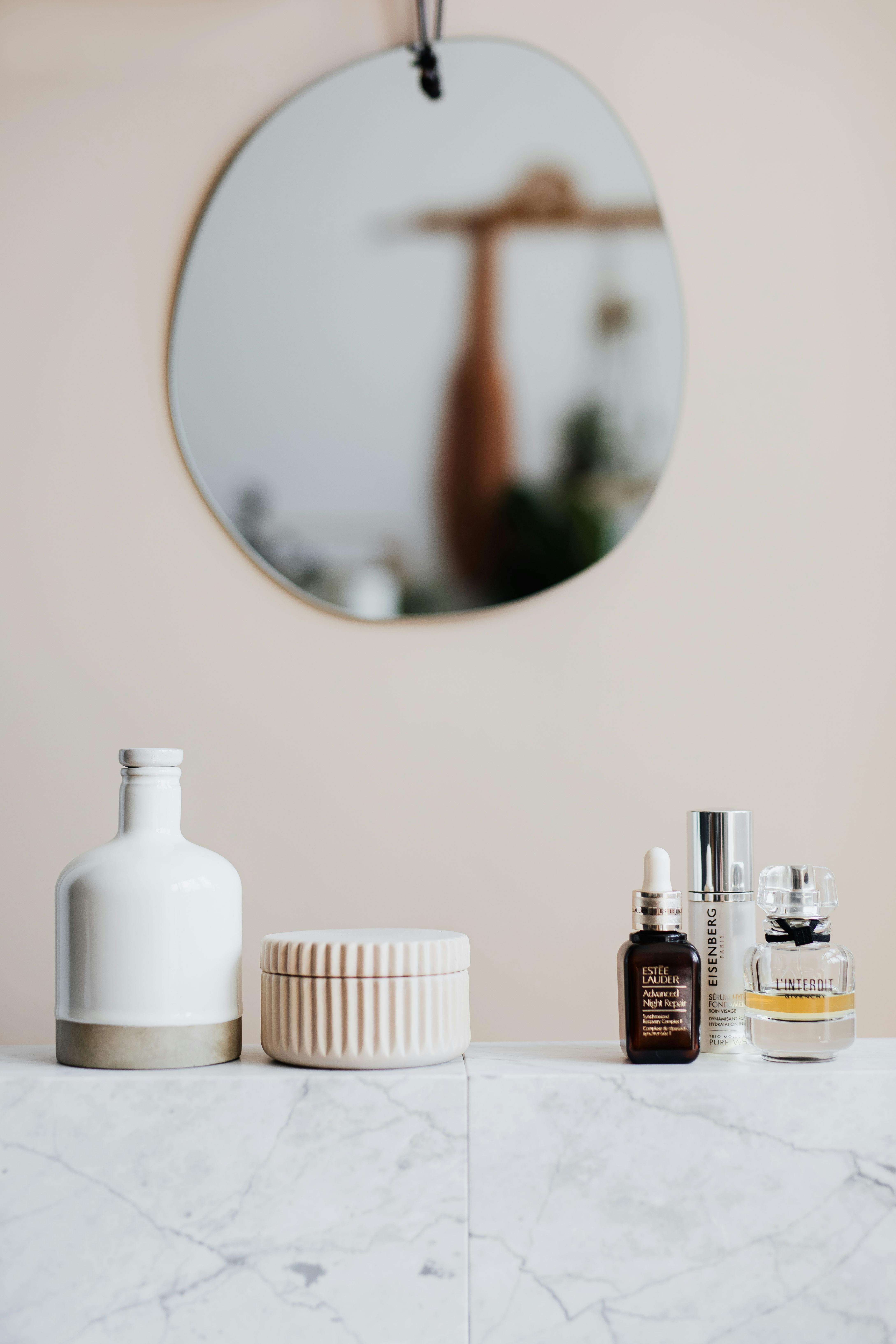
Texture and usage sequence = easy mental adoption.
When arranged light to heavy or in actual application order, the viewer can imagine themselves moving through the routine without friction.
You’re literally lowering cognitive load — they don’t have to think “wait, when do I use this?” You’re solving problems before they even know they have them. Preemptive seduction.
Colour cues can hack emotion.
Colours aren’t just “pretty” (god forbid we ever use that word).
Warm colours (reds, oranges) can create urgency or energy. Cool colours (blues, greens) feel calming and trustworthy. Neutrals or blacks = luxury and seriousness.
A well-thought-out colour gradient or repetition keeps the image cohesive and stops it from looking like a garage sale.