psychology thinking

Product Photography Psych: The Order Matters.

Why does product order even matter? The psychology behind it... We love a story arc, even in a photo. When we see a group of objects, our brain desperately tries to string them into a sequence: beginning → middle → climax → resolution.In skincare, this story is the routine. If your image makes someone feel the routine flow, they imagine themselves using the products (a.k.a. mental trial). And if they mentally try it, they’re closer to buying it. Sneaky? Absolutely.

Kate Edwards
July 22, 2025
5 min read

Humans are narrative blokes.

We love a story arc, even in a photo. When we see a group of objects, our brain desperately tries to string them into a sequence: beginning → middle → climax → resolution.

In skincare, this story is the routine. If your image makes someone feel the routine flow, they imagine themselves using the products (a.k.a. mental trial). And if they mentally try it, they’re closer to buying it. Sneaky? Absolutely.

The eye loves rhythm and balance.

The human eye is obsessed with patterns, symmetry, and flow. When shit is chaotic in a bad way, it triggers discomfort (and no one drops cash when they’re uncomfy).

The arrangement’s shape — triangle, pyramid, soft wave — guides the eye smoothly and keeps attention locked longer. More time looking = higher chance of desire = swipe that fucking credit card.

Size hierarchy triggers authority.

When a product is bigger or placed centrally, it’s perceived as the leader, the “main character.” People instinctively trust and gravitate towards the biggest or most prominent element first.

The same primal rule that made us obey the biggest caveman now makes us worship that shiny serum bottle in the middle. Savage.

Texture and usage sequence = easy mental adoption.

When arranged light to heavy or in actual application order, the viewer can imagine themselves moving through the routine without friction.

You’re literally lowering cognitive load — they don’t have to think “wait, when do I use this?” You’re solving problems before they even know they have them. Preemptive seduction.

Colour cues can hack emotion.

Colours aren’t just “pretty” (god forbid we ever use that word).

Warm colours (reds, oranges) can create urgency or energy. Cool colours (blues, greens) feel calming and trustworthy. Neutrals or blacks = luxury and seriousness.

A well-thought-out colour gradient or repetition keeps the image cohesive and stops it from looking like a garage sale.

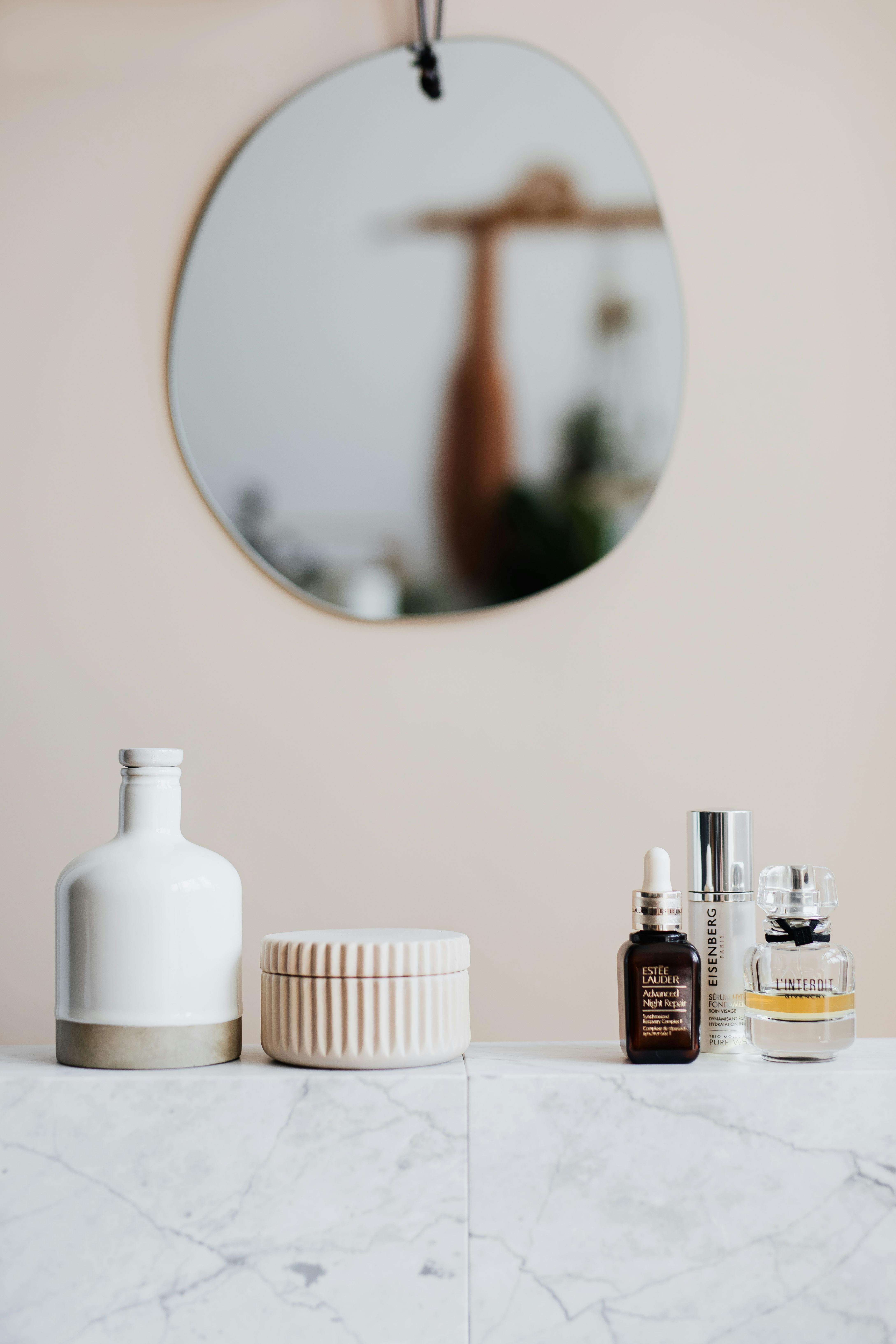
Influence of shape and packaging style

  • Tall, slim bottles = elegance, minimalism, refinement.
  • Short, wide jars = nourishment, comfort, indulgence.
  • Dropper bottles = precision, scientific, targeted care.

How you arrange these subconsciously primes how your audience feels about the products before they even read a word. That’s why it matters.

The subtle power of angles and gestures

  • Tilted slightly toward camera — welcoming, inviting.
  • Straight up, army stance — strong, serious, authoritative.
  • Clustered closely — community, completeness (but watch out, can look cluttered).
  • Spaced apart — exclusivity, premium, each item shines alone.

Even micro-angles can change perceived accessibility. That’s why product stylists get paid actual money to move bottles half a centimetre all day long.

Final manipulative nuggets

  • Leading lines (diagonal props, shadows, or edges pointing to hero) — push focus exactly where you want it.
  • Negative space — used intentionally, makes each product feel more important (hello, luxury).
  • Layering foreground and background elements — adds depth and richness, feels editorial instead of “basic online shop.”

What this all adds up to

You aren’t just lining up bottles. You’re creating an invitation to fantasise, a carefully orchestrated mindfuck that makes people need that $120 serum because they already felt themselves gliding it on.

Product photography is a silent psychological hit job. Done right, it seduces wallets open without saying a damn word.